Well, after lots of sneaky peeks, I thought it was time to put some "real stuff" on my blog.... She's coming in with the cards! As many of you know, amongst all my full blown inky antics, lies a passion for simplicity and purity.
This week at
Less is More we can mix things up, so I playing with a touch of red, squares and ribbon to name but a few.
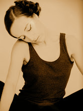
I think a lot of my arty notions reflect my dance training. I've studied classical ballet, modern jazz and contemporary dance with a real love for choreography. I think this style is kind of akin to the ballet. Purity, a sense of line and definite shapes.
I can never get enough of red and white and decided to break open my new Ranger Vermilion ink pad. I'm glad to say it's true red, red... if you know what I mean!
The stamp is one of my first ever and a real favourite from Hampton Art. I used it a while back in a similar way, but I really wanted to see how things would look in such a vibrant tone. Mucho likey...
A strong image and pure colours do all the talking... I added a little ribbon and lace to set them off, choosing textured card stock for a little more detail.
After stamping and cutting them all out, I just played around with them seeing how they fitted together. It might sound strange, but give them a moment and they will tell you how they feel...
Thanks very much for calling by and taking a peek...does the red do it for you??? Ok, she's signing off...
Sarah.


22 comments:
So simple yet so stunningly effective. Beautiful x
The red definitely does it for me Sarah. Simply stunning. Tracy x
Absolutely adorable! Loving the simplicity... TFS x
It takes a real artistic eye to be able to put together simple shapes and elements like these and make them look so stunning... you have it in spades!
Wonderful Sarah!
Thanks so much
Chrissie
"Less is More"
As they say simple is best and you have proved this with your cards !x
FANTASTIC Sarah
Im in awe of your artistc talents
Wonderful!
Thank you very much
Mandi Diva LIM
"Less is More"
It does it for me when you use it. When I use it, it looks like blood and bandages!
Oh WOW these are all just simply stunning :)
RED i smy fave colour ! And your card are so simply and simply amazing!
Fabulous cards, love all, beautiful colour combination and design, Gay xxx
Beautiful, a stunning design.
These are beautiful. Love the addition of the lace. xx
Oh wow, these are so stunning and really affective. The red is amazing. Lee xx
Love the simplicity of these. I often want to keep my art this simple but end up putting "just a bit more on" Need to be more disciplined and remember the mantra less is more and yes the red really does sing!
Crosby was on Saturday, Jo has some interesting photo's of me 'playing' with the artwork....
Dx
Stunning CAS creations - so artistic and beautiful.
Sylvia x
very striking against the white!! love these :)
LOVE!
These are absolutely stunning!
Gorgeous cards, red and white is stunning and the added lace gives a little extra. x
Great cards xx Jan
So simple but sooo elegant! Sometimes less really is more! :)
Post a Comment